Welcome to the third part of a short review of Lord of the Rings Online that I hope I can keep to four parts. Parts one and two have come before this one (I like a traditional numbering scheme) and part four is on the way.
3. Technology
With any luck, this part will be short! The content and system behind an on-line roleplaying game combine to make up much of the overall experience. Certainly for many players those two things are enough to decide the fate of a game. However, how the game is actually presented on the screen and how the different technology elements work can also make or break a game for quite a large section of the player base. That’s what this part is going to talk about.
3.1 Interface
The interface is the window through which we look at the game and the system through which we control it. Bad interface design has killed games in the past and will sadly kill games in the future. I freely admit I struggled with the LoTRO interface at the outset. I was very used to EverQuest after 7 years, and I wasn’t at all sure about changing. Over time though I have gotten used to it and while there are features which annoy me there aren’t any show stoppers. Discussing the interface in full detail would take hours and thousands of words, I’m not going to do that so I’ll just give you a general feel for it.
The interface is actually several elements,
- how do you control the game
- how does the game display information to you
- how does the game handle chat
- how can you configure those three things to suit you
3.1.1 Control
I’ll handle control first. Basic movement in LoTRO is pretty standard, cursor keys or WASD for moving around, combinations of keys to look around rather than turn. You can use left mouse button + mouse to turn and right mouse button + mouse to look. Holding down both mouse buttons makes you move in the direction your character is facing. You can mix and match all those combinations. Anyone who’s played a FPS or a recent MMORPG will find using that control system easy, it’s pretty standard these days. You can position the camera either floating behind the character (3rd person) or inside the character (so the game is 1st person). I played EQ in 1st person but for some reason LoTRO works a lot better for me in 3rd person and I’m pretty used to it now.
Other than moving, you have to select things on the screen such as enemy targets or things to pick up and also trigger skills. Selecting stuff is achieved through regular left clicking, but you can also map various keys so that you can cycle through visible enemy targets or select the nearest object (like a leaf on the ground, or a door, or some wood to harvest). Those keys speed things up a lot especially when the scenery sometimes gets in the way of clicking (which isn’t common, but does happen), or because your 5 friends are blocking your view and ability to click on the enemy.
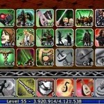
Triggering skills is a simple matter of clicking on the quick-slot or hitting the appropriate key. The first quick-slot bar is triggered by keys 1 through =, the next by CTRL+ 1 through =, then by ALT + 1 through =, then SHIFT + 1 through =, etc. You can choose how many quick-slots to have on screen at any time, and you can place them horizontally or vertically and move them around at will. In the early part of the game, one is enough, in later parts you may find that even with four you struggle to have all your skills available at the same time. I do struggle in 1024 x 768 to have all my minstrel skills on-screen and still have enough screen space to see the enemy.
You can choose to have quick-slot bars hidden until you press the CTRL/SHIFT/ALT keys at which point they pop up, or you can opt to have them visible all the time. Clearly if you want to use the mouse most often to trigger them you need them visible, or you need to hit CTRL (for example) and then click the mouse. If you prefer the keyboard, and have a good finger memory, you can get away with having fewer quick-slots on screen at any one moment.
All of this takes some getting used to for people who’ve come from EQ, where there are generally far fewer things you need to click on during combat, however I should think for people used to WoW, EQII, etc. it’s much more familiar.
3.1.2 Display
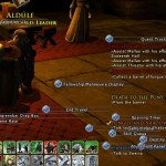
The LoTRO display is pretty busy; there’s a lot going on, on the screen. You have the quick-slot bars with skills active, shaded out if inactive or showing a count-down shader if they’re on a cool-down. You have the mini-map somewhere, some quest log information which sometimes flashes as you complete quests, your own vitality window showing your morale and power, and maybe another mini-one for your pet. If you’re in a fellowship you’ll have a bunch more vitality boxes for each of your fellowship members and their pets. When you have something targeted you’ll also have their vitality information on show somewhere on the screen. You also have target rings around the enemy showing you who you’ve got targeted and maybe who they have targeted as well and during combat you’ll have a whole bunch of numbers and text floating around above the enemy. Finally, you’ll be seeing spell effects and combat effects during any fights.
It takes some getting used to if you’ve come from a more spartan game before, but I guess it isn’t that much different to similar games like EQII or WoW. I find the overall interface elements bright and clear and it’s pretty obvious what information each one is providing. The in-combat text isn’t always entirely obvious, and although you can customise how much gets displayed I’ve not found a setting which really adds much value, so I tend to turn it all on because it makes the combat feel more involved!
I like the look of the interface objects, they’re in-character without being totally over-busy individually, although they can certainly mount up into a very busy screen as I said above. Most of the elements have mouse-over text which either provides more information or describes what you’re looking at.
3.1.3 Chat
 Chat is a critical element of any on-line game for me, after all if I wasn’t going to be chatting to people I’d be playing a single-player game. By default, all text information goes to a single window with multiple tabs. Each tab can be configured to filter in or out a huge range of chat/text sources and you can add your own tabs. So you can have the same source (say all fellowship chat) turning up in more than one tab. You can also drag tabs out to form new chat windows elsewhere on the screen but since I’m already struggling for screen real-estate I don’t do that. You can change the colours used for text from any of the possible sources.
If new content turns up in a tab you’re not looking at, it gets a little asterisk against the tab name, although this doesn’t help for tabs which you can’t see (if you have more tabs than you can fit into the width of the text window, then you have to click along to them and don’t see the asterisk).
I start my customisations by making the text smaller (although I wish I could shrink it even more) and creating a new tab which collects kinship (like a guild / clan) and fellowship (group) chat in one place. I then filter out a couple of channels I’m not usually interested in (looking for fellowship for example) and send them to a tab I tend not to look at.
That gives me a general text window in which I can see most stuff, a chat window I can check if I’m just talking to friends, and everything else going to the other windows which I can ignore. Overall it’s a pretty flexible system.
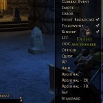
There are a large range of channels in LoTRO, mostly restricted by geographical region. There’s /say for people within range, /fellowship, /kinship, /ooc for region based out of character chat, /advice for region based game queries, /trade, /lff (looking for fellowship) and /rp (roleplay) for example. Text can also be filtered in or out if it is emotes, quest text, combat related, etc., etc. Check the thumbnail image above for the full list.
The last element worth mentioning about the chat window is the option for tell windows. You can put text from /tells in any tab, but there’s another tab at the end of the tab list which has a complete list of everyone who’s sent you a /tell this session, and you can click their name to get a full list of the tells to/from that person only. If you’re very chatty and very involved in a lot of direct conversation that can prove very useful.
I find text in the chat window scrolls past very quickly and I’m more prone to missing things in LoTRO than I was in EverQuest, but I’m not totally sure on the reason for that. Maybe the text is too big or the window doesn’t hold enough information, it’s hard to say, but I certainly don’t find it as useful as it might be, and when both myself and Grete are grouped with other people we often find ourselves pointing out text to each other that we missed.
3.1.4 Configuration
 I’m going to keep this section short. I’ve not played with skinning the LoTRO interface, and I’m not even sure if it’s possible.
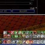
The location of every window and interface object can be changed (some windows you just drag around, but for objects which are ‘locked’ or have no handles, you change the UI into ‘customise’ mode and drag them about, see the thumbnail image). I like this feature, it’s easy to use. You can also shrink UI elements individually or en masse using sliders in the options dialog which is a nice touch (see thumbnails below this section). You can’t do all the elements, and some elements are linked even though you’d rather they weren’t, but it’s a nice feature non-the-less.
The configuration for how everything is setup including location, text filters, colours, etc. is stored server side, not locally. This is supposed to be there to prevent any hacks giving people the edge. However, there’s no way of storing this locally on a per-character basis, or exporting it or importing it. So every new character you start, you have to completely customise the interface manually. If like me you tend to make a lot of changes to window positions, this means starting a new character is going to be painful. This for me is the single biggest complaint I have about LoTRO (yes! finally a negative point). Please Turbine, add an option to share UI configs between characters. I’ve not even touched on the 30 or so settings in the options dialog which are UI related and character specific that you may want to tweak, again with no way of sharing them between characters. It’s a truly fundamental flaw with no sign of being fixed.
3.2 Graphics
 How the characters and world looks for me is a secondary concern, I’m really more interested in gameplay and content. After all, I put up with EverQuest for long enough. However, I find Lord of the Rings Online pretty impressive. I play with custom graphics settings ranging from medium to high and I don’t suffer any graphical lag on my quad core box. The creatures are pretty well rendered and even something as generic as an orc differs greatly in appearance depending on where you are in the world. The player character models have a breathtaking range of looks depending on what they’re wearing and the options used to initially create them, and I find the animation on the whole pretty impressive. Different races have unique animations for common actions, which really adds to the visual richness of the game.
Combat animations are interesting and continually improving, different skills produce different actions on-screen and provide a very nice positive feedback mechanism.
There are some graphical glitches, sometimes you get stuck gliding around instead of having your legs move, sometimes you might get an arrow stuck to your hand or be holding an open book instead of the staff you were expecting, but for the most part they don’t interfere with the enjoyment.
The one aspect of the graphics engine that is really stunning though, is the scenery. It truly evokes a feeling of being within Middle Earth. There are huge open expanses, massive mountains, huge stone carvings, massive indoor halls, beautiful elven abodes, trees, roads, grass, water (reflective), skies and buildings. Every location looks and feels different, is totally in-character with the lore and the world flows together seamlessly. I can’t praise this element of the game highly enough and with the introduction of Moria the art folks have outdone themselves.
It’s a pure joy to run around Middle Earth and see the sights.
3.3 Scripts
 I just had to find somewhere to talk about the scripting engine in LoTRO. I’m pretty jaded after spending a long time playing EverQuest. In escort missions you had to be careful not to cast AE’s on the person you were trying to escort and you couldn’t really heal them. They would get lost or stuck behind the smallest objects as the pathing engine failed you, or would just warp around. Creatures would spawn under the world and ruin quests where you had to track them down, objects would vanish, and basically despite the best efforts of the excellent design team the engine just didn’t support any seriously fancy interactions.
Which is probably one of the reasons I’m in love with the LoTRO script engine, and the things the development team do with it. Every time I get an escort mission and the NPC essentially joins your party (so you can heal them, for example), and doesn’t attack you if you accidentally target them with an attack, I’m impressed. NPC’s working in this way tend to run off and attack stuff, but they then run back to the exact point they were at when they decided to engage something, and continue walking in whatever direction they should go. While this sometimes looks comical, it certainly ensures you don’t go wildly off-track and get lost or stuck.
NPC’s can flip between attackable and non-attackable any number of times during a fight, and can engage in conversation with you or other NPC’s during those phases, and so far we’ve never managed to accidentally kill an NPC just before it switched which was all-too-easy in EverQuest. Many NPC’s can be involved in the same scripted piece, one quest in the Epic storyline series sees you running through an area with a whole bunch of ghostly allies killing anything you meet. It may be simple, but it’s effective.
You can summon enemies (used a lot in Moria), burn down tents, destroy carts, put fires out, carry water, take part in horses races and a whole range of other activities because the script engine is solid, reliable and well thought out. I’ve certainly experienced bugs, but those bugs get fixed, the underlying technology is robust and clever and gives the design team plenty of hooks to get you engaged.
3.4 Summary
The technology behind LoTRO is impressive, and although I have some strong reservations about the way UI customisation is stored, and it can take a while to get used to the busy screen, once you do get past those issues the interface enhances game play and improves the overall experience. Combined with the brilliant script engine, the wealth of quests and the truly superb graphics LoTRO looks good, and plays good.

